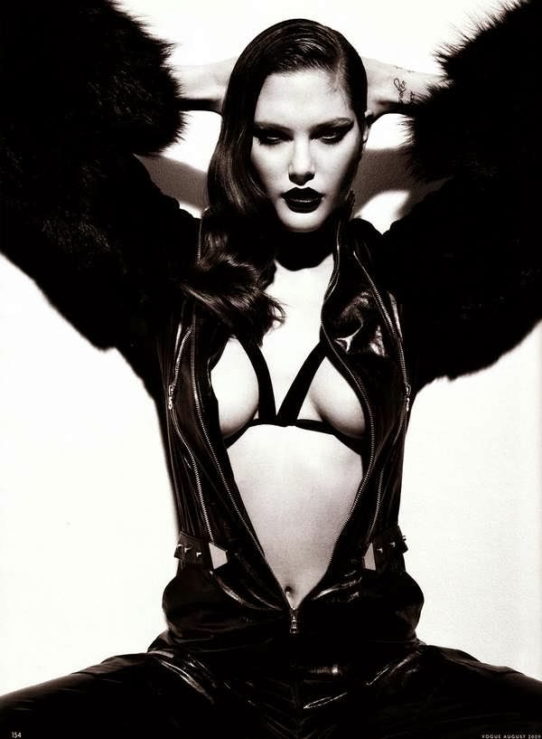
I took a variety of pictures of my model Francesca for my front cover. I will possibly use some of these pictures also in my contents page and double page spread. Some of the pictures look more effective than others so I will take this into account when choosing the images I will use. I will edit them to make them look even better to achieve the professional look.
Friday, 31 January 2014
Thursday, 30 January 2014
Cover Page Ideas
I used some pictures I found that gave me inspiration for the style of image I could use on my front cover, and placed them onto Publisher with a potential masthead style just to give me an idea of what the base of my cover could maybe look like.


Friday, 24 January 2014
Model
My model is called Francesca Hutton and she is 16 years old. I think her look and style is very editorial and mature, and she has the look of a stylish pop star that would be attractive to my target demographic. I will be styling her outfit, hair and make up to create the perfect look I am going for.


Colour Scheme
After analysing existing magazines, I have seen that magazines aimed at a more mature demographic use simplistic colours with features that pop out, and are not too busy and chaotic in contrast to those that are targeted at a younger audience. I have started to think about the colours I would like to use to make sure I fully appeal to my target demographic. I have chosen to go for quite neutral colours as I think this will make my magazine look professional and cool; I will possibly use other brighter colours, but just as a small feature on certain pages to make it stand out.


Front Cover Photo Shoot Ideas
I have decided to have a female solo artist on my front cover as from my questionnaire results, Beyoncé was a very popular answer when I asked 'Which solo artist would most likely draw you to a magazine if they were on the cover?' I have decided not to feature a band on the cover as my results showed Arctic Monkeys to be the band most likely to draw the audience to a magazine. As they are an indie band, this type of image would not fit with my genre of pop, and I believe a solo artist would look better on the cover of a more mature, glossy magazine. I researched some pictures of editorial photo shoots to get some inspiration.


Masthead Fonts
I looked through many different fonts on the website 'Da Font' that I could potentially use for my magazine masthead, and came across a few that I liked. I want to keep the font for the masthead very simple as I believe this will look more professional on a magazine that is aimed at an older audience, and will fit in well with a sophisticated name that also appeals to the more mature demographic.
I have decided to name my magazine 'X' as I like the connotations surrounding it: 'A quality you cannot describe that makes something very special'. I also think a one-letter title is very effective as it will stick in the audience's mind, and appeal to the age group I'm targeting. It also leaves the audience in anticipation because the X could mean anything, therefore they don't know what to expect: it has a sense of mystery surrounding it. This will make the audience want to purchase the magazine so they can find out exactly what it's like. I am going to use the 'Neou' font for my masthead as I think the X looks better in this one. I will consider highlighting the X with a box to make sure it stands out as I am aware the font is very simple.
I have decided to name my magazine 'X' as I like the connotations surrounding it: 'A quality you cannot describe that makes something very special'. I also think a one-letter title is very effective as it will stick in the audience's mind, and appeal to the age group I'm targeting. It also leaves the audience in anticipation because the X could mean anything, therefore they don't know what to expect: it has a sense of mystery surrounding it. This will make the audience want to purchase the magazine so they can find out exactly what it's like. I am going to use the 'Neou' font for my masthead as I think the X looks better in this one. I will consider highlighting the X with a box to make sure it stands out as I am aware the font is very simple.


Thursday, 23 January 2014
Magazine Name Ideas
I came up with a number of magazine name ideas that I thought would tie in with the type of magazine I wish to produce. Each name has different connotations that all fit in with a musical theme.
Monday, 20 January 2014
Target Audience Research - Existing Music Magazines
From conducting my questionnaire, I found that Q and Rolling Stone magazines were the most popular (taking into account that the genre and style of these magazines is similar, therefore their individual results can be combined). I decided to research into them to find out more about what my target audience would like to see from my magazine.
Saturday, 18 January 2014
Target Audience Research
I decided to interview some people from my target audience to find out even more about what they like to see from music magazines. This will give me a bit more of an idea as to what I can include in my work so that it fully appeals to my demographic.
Friday, 17 January 2014
Questionnaire
I devised a questionnaire to get a general idea about what people want from a music magazine. I decided to ask mostly young adults between the ages 16 and 21 because I would like my magazine to appeal to partly this age group, however I asked one person in the 34+ category because I want my audience to be 16-35. This way, my magazine will appeal to a wider audience. From my results, I have found that the most popular music genre with my audience is pop, although a popular music magazine is NME. However, Q and Rolling Stone were also popular and have a similar genre and style to each other, and with their results together, these magazines were more popular than NME. I will take this into account when creating my magazine: it will have the look and feel of Q or Rolling Stone and be in the genre of pop. This will give my magazine a more glossy, up-market feel that will appeal to my audience, as the target demographic for Q magazine is mainly people in their 30s, and Rolling Stone is 18-30. I decided to ask both males and females as I want my magazine to appeal to both genders, however I would like to target it more towards females. Q is mainly aimed at males, but I will include features that are attractive to both genders, giving it a wider appeal. I asked what band/solo artist would most likely attract my audience to the cover of a magazine because, I can maybe base my cover photo on the style of the most popular bands or solo artists chosen by my demographic. I will take into consideration the results of this when carrying out my photo shoot.


Thursday, 16 January 2014
Double Page Spreads
I analysed some existing double page spreads to see how they are laid out, and to give me some ideas about what features I could use in my magazine. There were some features I liked and some that I didn't, however this gave me a deeper insight into what I want my double page to possibly be like; I have now seen how existing articles appeal to their specific audiences. I have noticed that all the articles for older audiences seem to use quite simplistic features with an added pop of colour, and the articles for younger audiences are brighter and seem busier. I will take this into account when creating my own double page.


Tuesday, 14 January 2014
Difference in Magazine Covers
I decided to look at as many magazine covers as possible from different magazines to see the differences and similarities between them. This gave me a chance to see what I like about certain covers, and allowed me to see what features I could possibly include to make my cover to the highest standard.

Thursday, 9 January 2014
Contents Pages
I decided to analyse some existing contents pages to see the contrast between them in different magazines.


Front Covers
I researched and analysed some existing magazine covers to see what real magazines look like, and too see what is appealing for the audience. It also gave me some ideas and allowed me to discover what I liked and didn't like about certain magazines.


Subscribe to:
Comments (Atom)